
Aqua Kyoto
Brand Identity · Symbol Design · Hospitality Branding
problem
Aqua Kyoto needed a symbol that could connect the restaurant's Japanese heritage with its new Parisian context while remaining effective across digital, print, and architectural applications.
Approach
I developed a crest rooted in traditional Japanese visual language while preserving elements already associated with Aqua. The goal was to create a symbol that felt culturally authentic, scalable, and timeless.

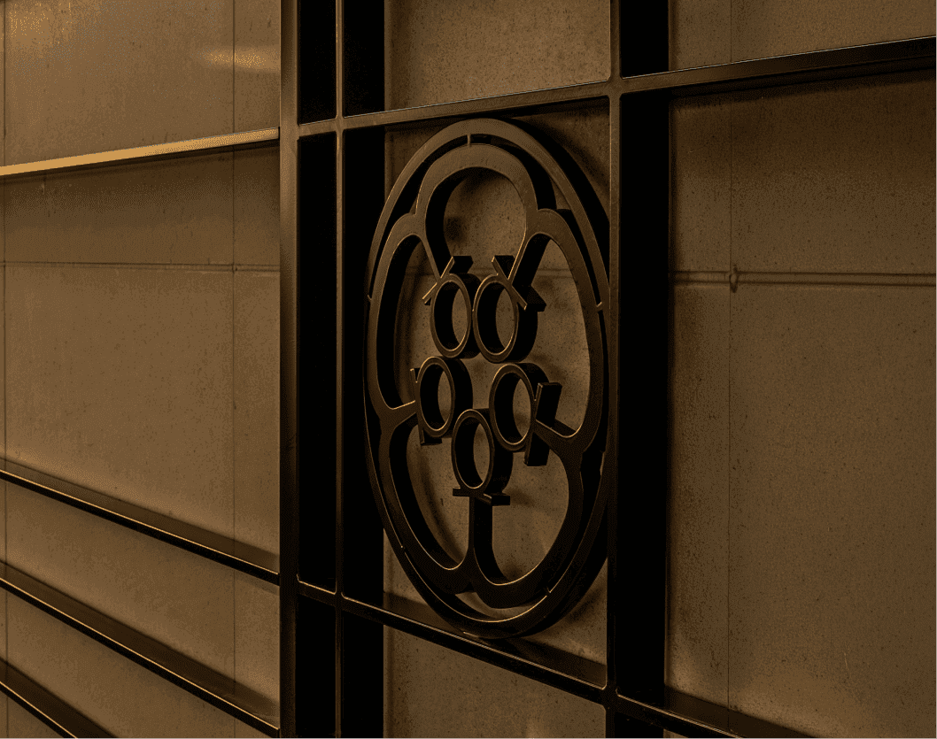
Crest Design
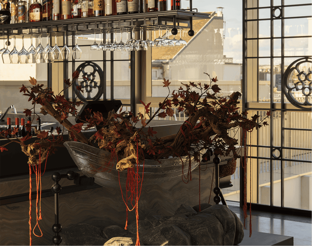
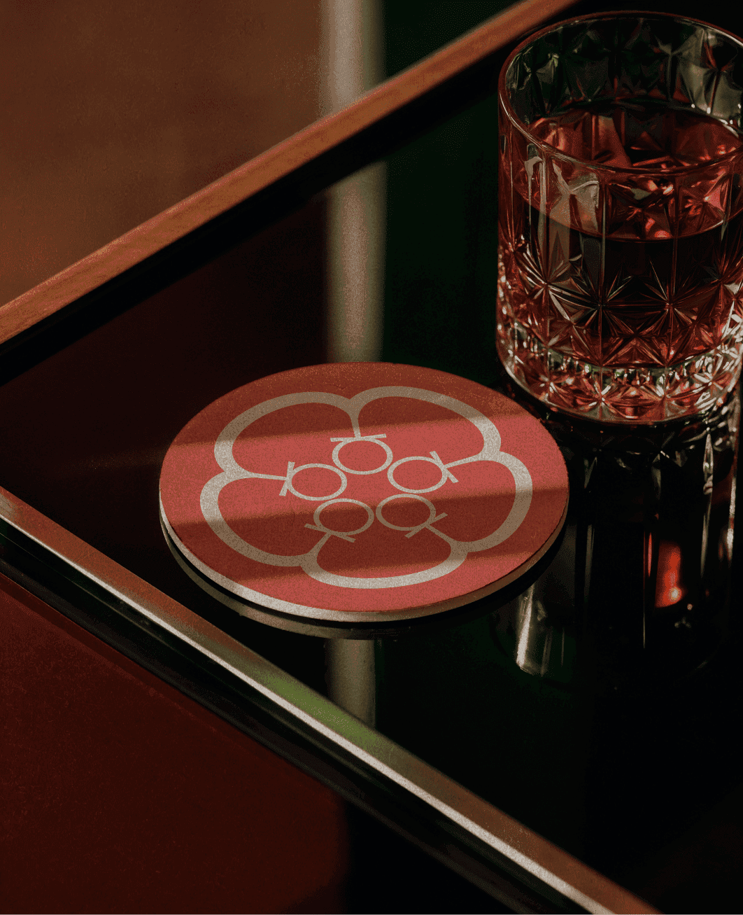
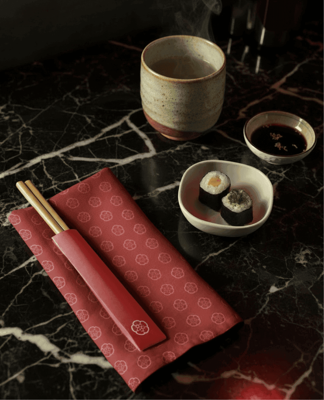
Built using geometric principles inspired by Japanese mon, the final mark combines Aqua Kyoto's existing Ankh symbol with the form of a Sakura flower. The geometry of the crest was then extended into menus, print collateral, environmental graphics, and digital assets.


Outcome
Originally developed for the Paris launch, the crest was later adopted as a global brand asset and continues to scale across digital, print, and architectural applications.
