Solving a conversion problem by splitting one cluttered website into two distinct journeys.
Client
Beetle Juice Events
My role
Digital Designer & Framer Developer
Focus
Information Architecture, User Journeys, Conversion
Challenge
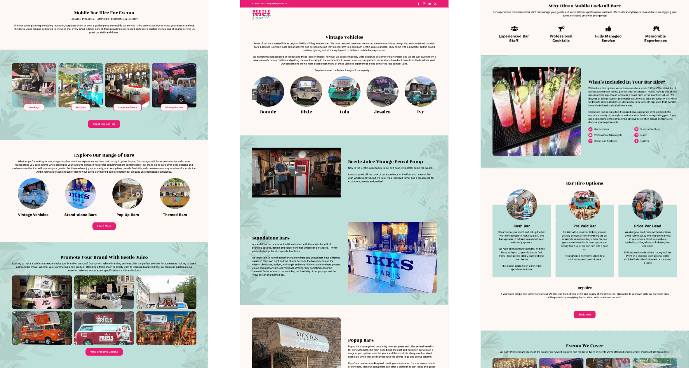
Beetle Juice is a high-energy mobile bar service, but its digital presence was a "one-size-fits-all" experience. By treating private wedding planners and corporate event leads as a single audience, the site created friction. Visual clutter and a lack of clear direction led to high bounce rates and abandoned enquiries from high-value clients.
Strategy
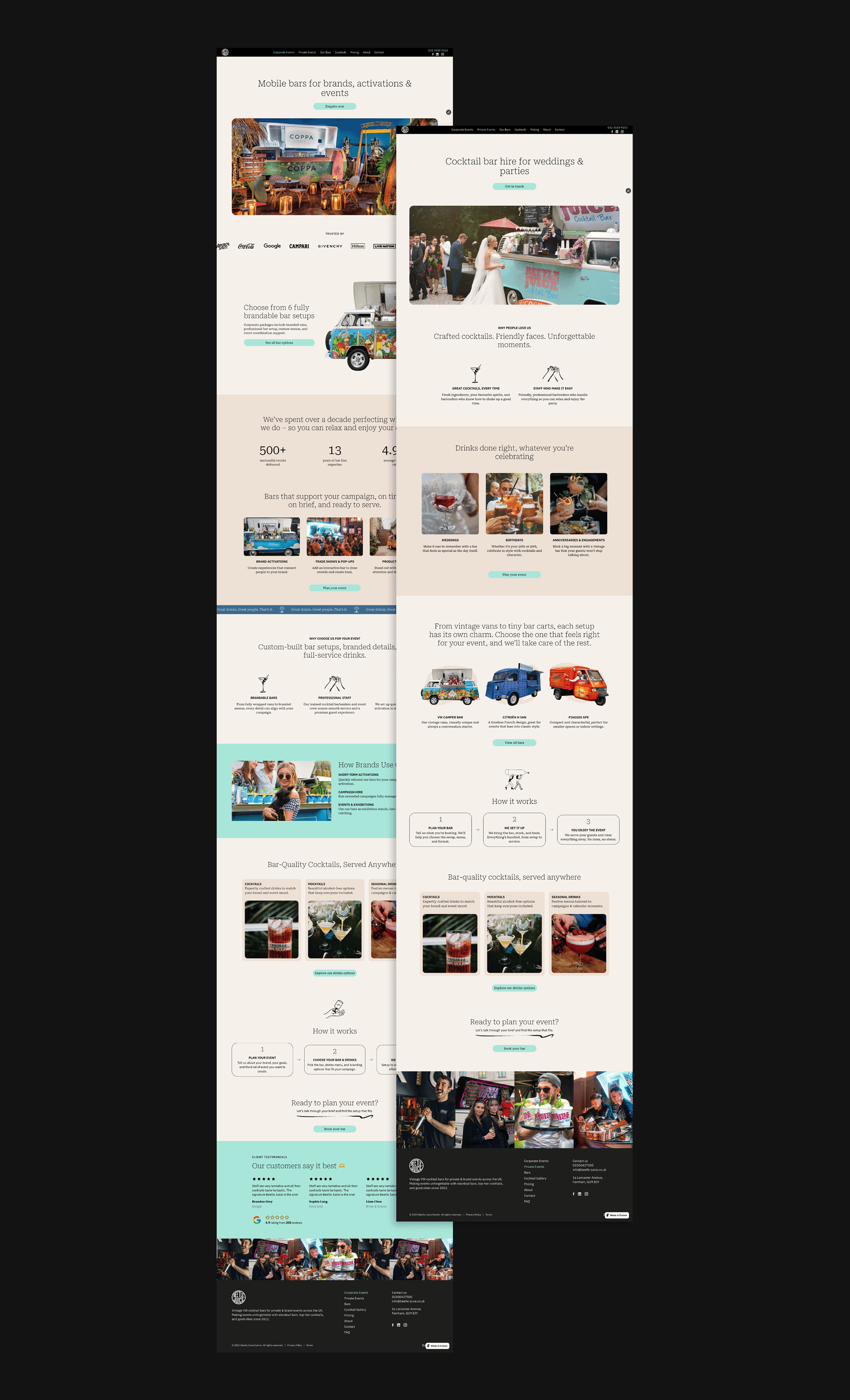
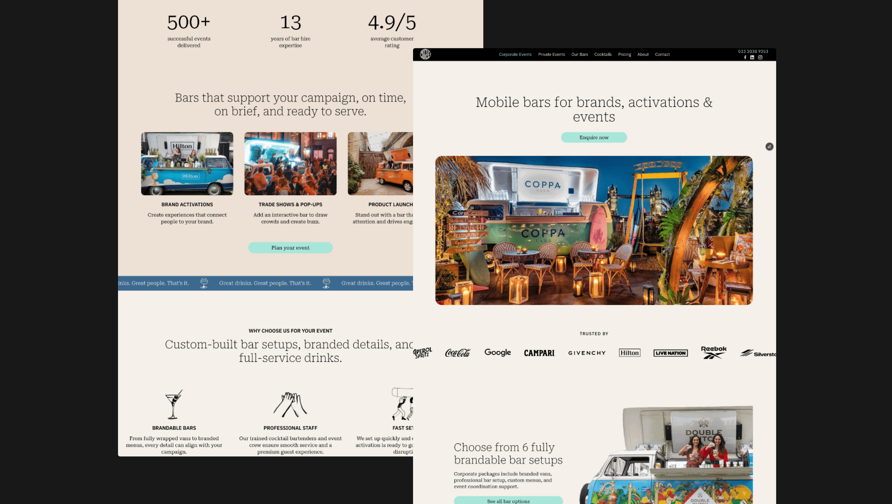
I restructured the site around audience routing to eliminate navigation "noise." This began with a split-navigation menu and a high-impact "pathway" section immediately below the hero, using visual cards to funnel users into two distinct journeys. Private clients were guided toward inspirational, package-based content, while corporate users followed a high-credibility path focused on branding and logistics. To ensure this vision was executed perfectly, I built the final experience in Framer, maintaining total control over the modern-vintage aesthetic and micro-interactions.
Outcome
Instant Clarity: Homepage cards and dual-menu items provide immediate direction for different user types.
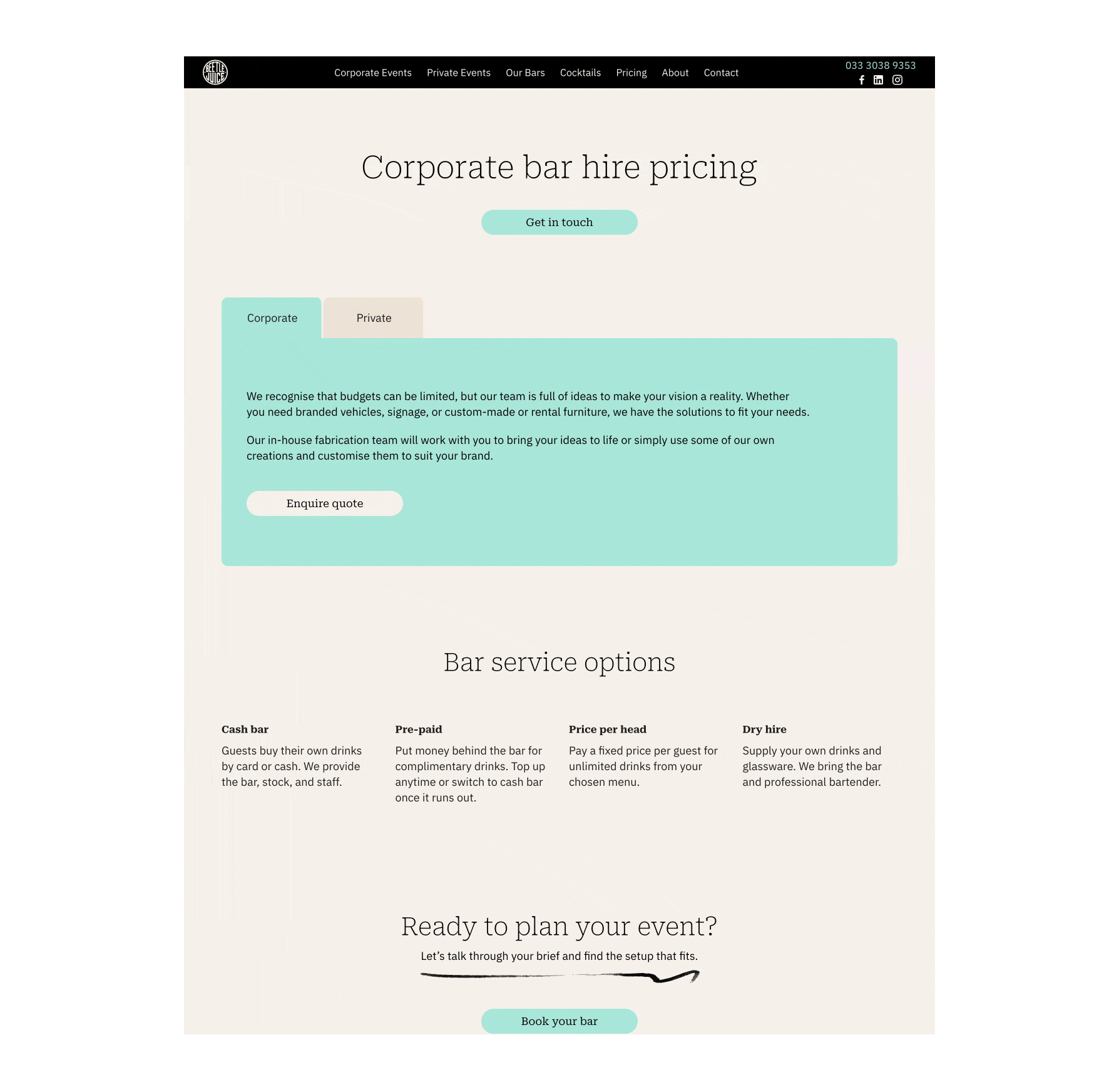
Decision-making: A tabbed, transparent pricing structure reduced cognitive load and friction.
Execution: By owning the build in Framer, I bypassed "lost in translation" development issues to deliver a pixel-perfect, high-conversion site.
Before the redesign