Dim Sum Library
Visual system · Print · Packaging · Illustration
Dim Sum Library already had a distinctive atmosphere - black-and-gold interiors, Art Deco detailing, and a balance of formality and warmth. I was tasked to create a visual system spanning menus, packaging, and guest collateral that felt connected to the restaurant experience.
problem
The challenge was creating a system that could work across multiple guest touchpoints without applying the same solution everywhere. Retail packaging needed to feel premium and giftable, afternoon tea menus needed to remain readable in a dimly lit environment, and takeaway materials needed to help customers quickly identify products.

Packaging Design
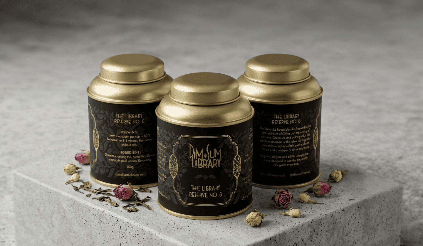
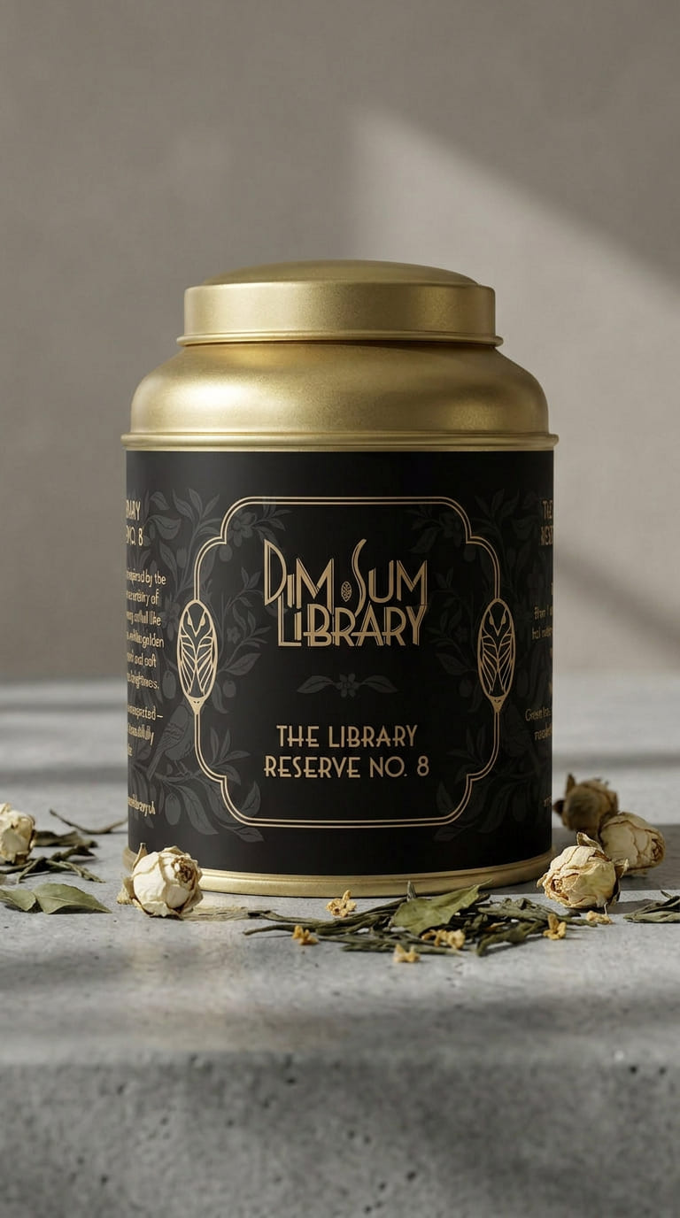
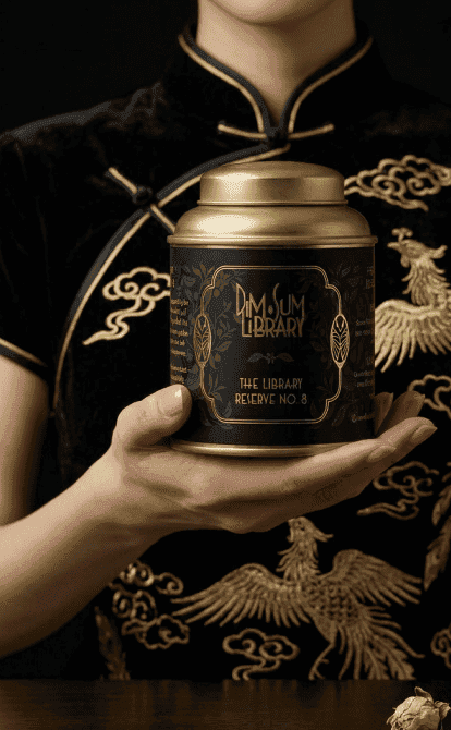
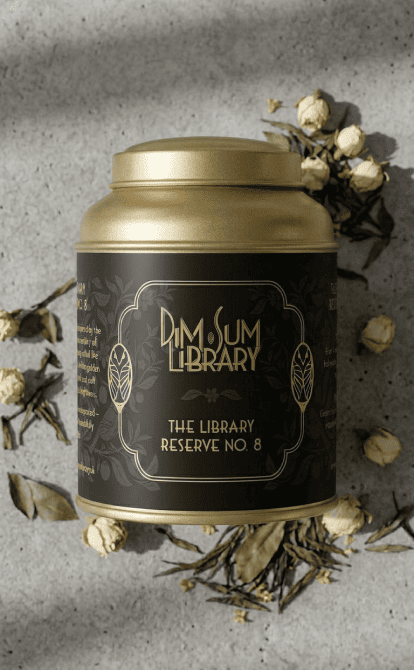
The tea caddies represent the core brand expression, using black-and-gold botanical illustration and refined typography to create packaging designed as retail objects rather than table pieces. During development, I also recommended changing the product name from No. 4 to avoid negative cultural associations.



Experience & Menu Design
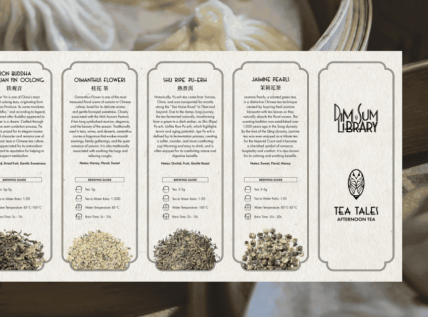
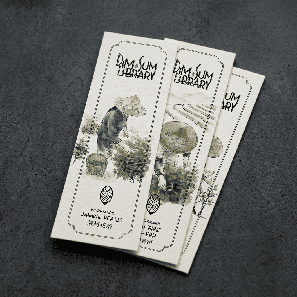
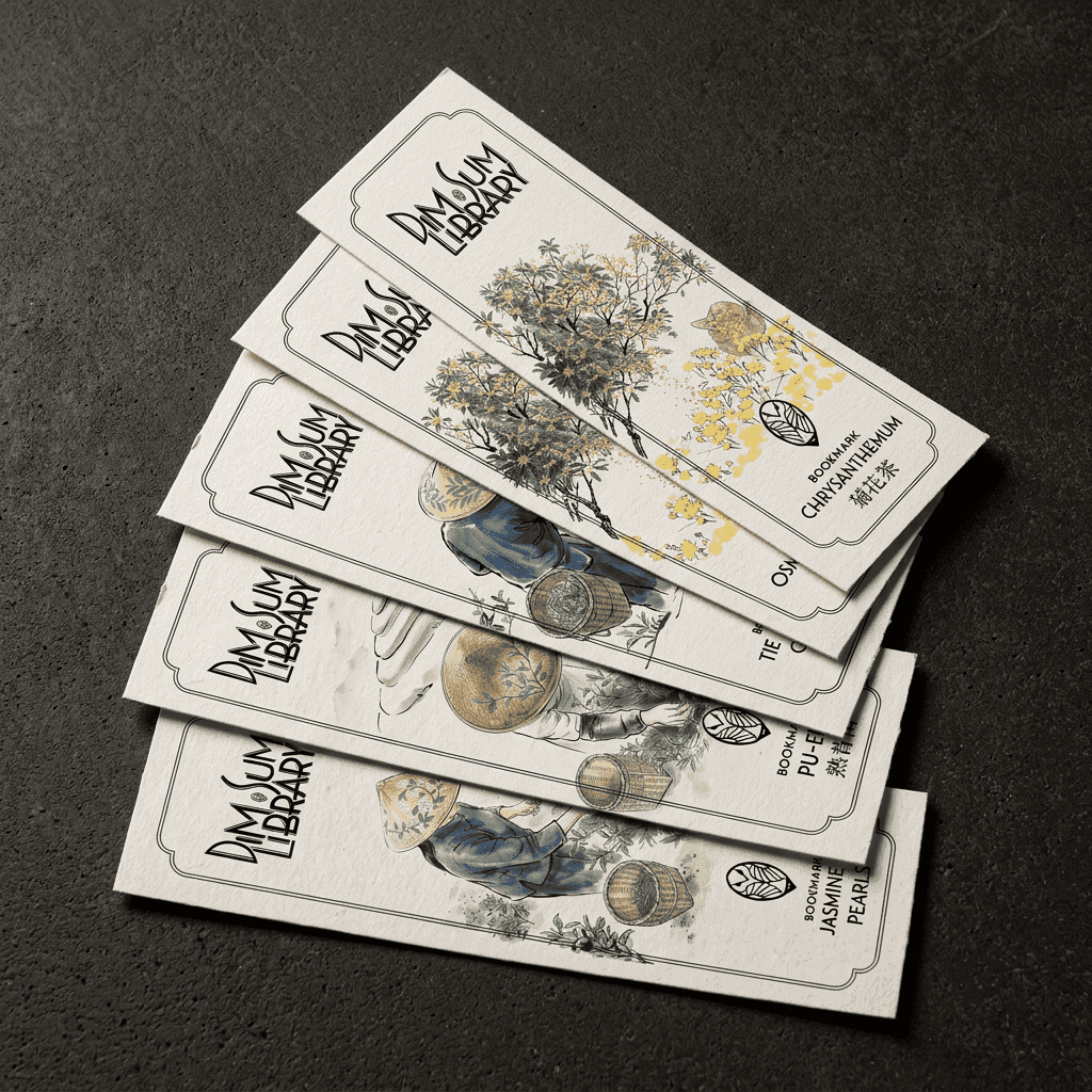
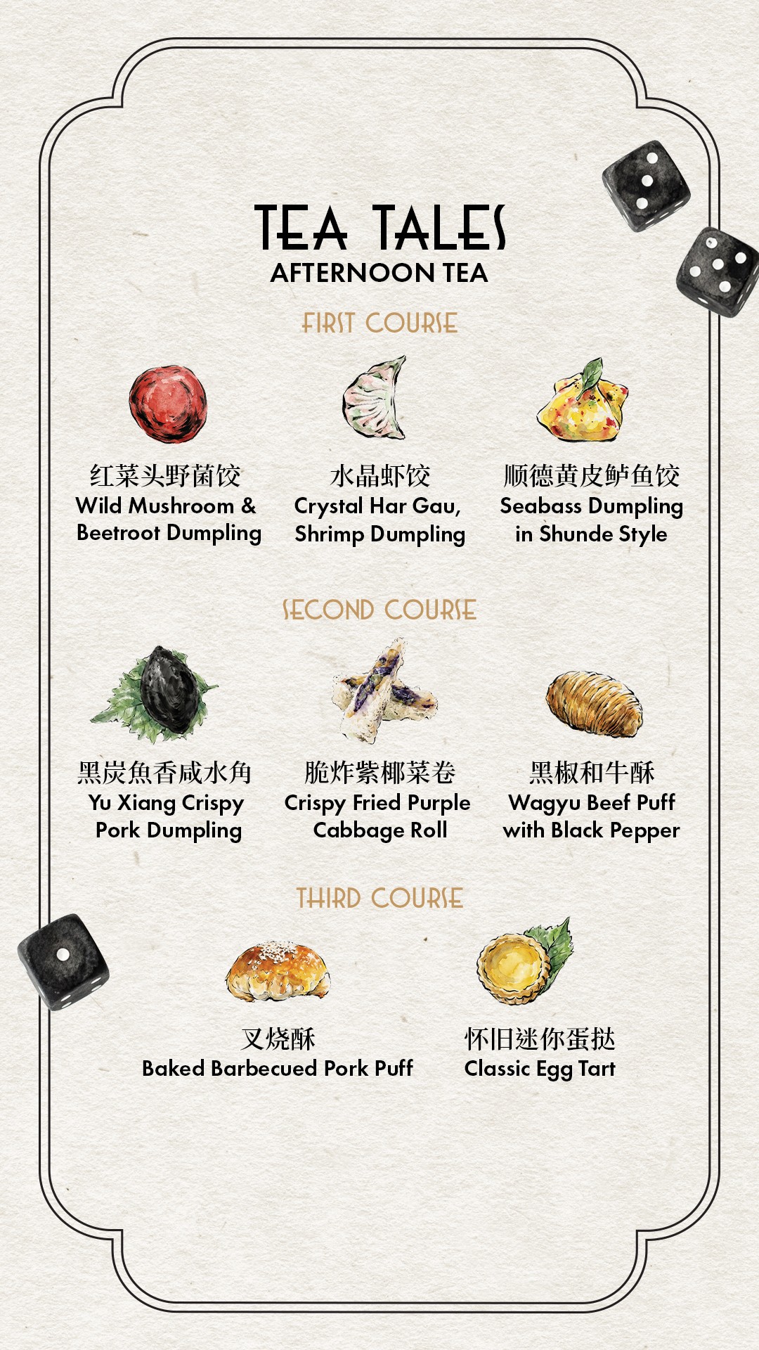
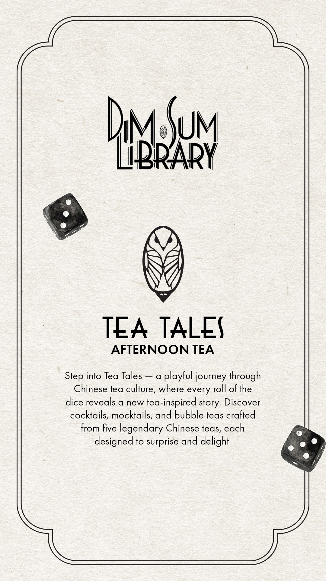
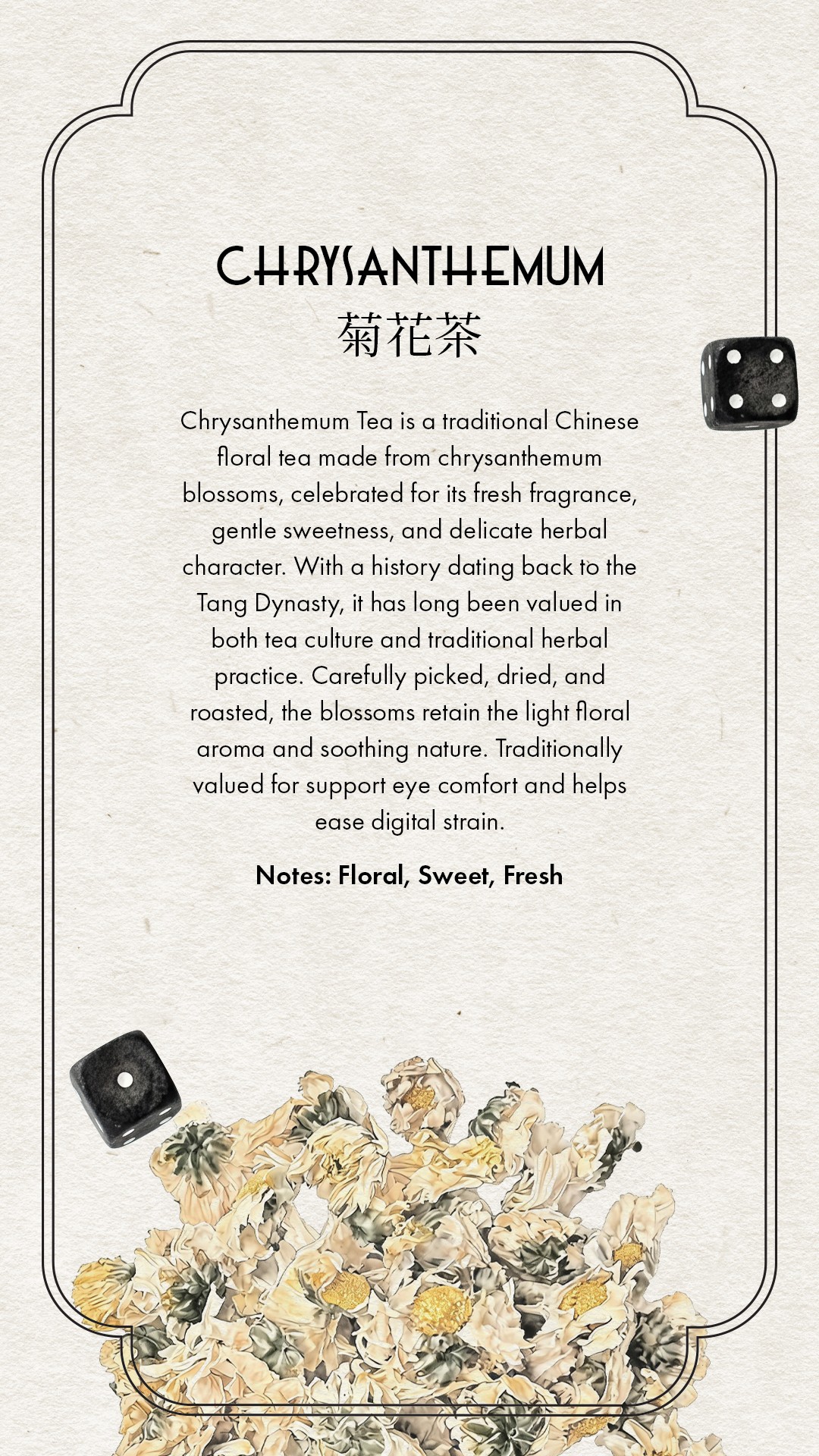
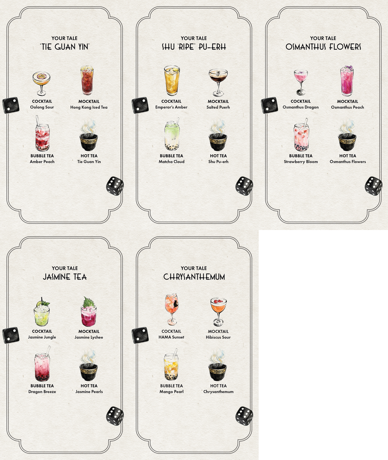
For the afternoon tea experience, the identity was extended through textured paper backgrounds and watercolour illustrations inspired by Chinese brushwork. This softer approach improved readability in the restaurant's dim lighting while creating a warmer, more approachable experience at the table.




Outcome
The visual system was rolled out across menus, packaging, and guest collateral throughout the venue.
Following the relaunch, afternoon tea revenue increased by 52% week-on-week, while covers increased by 74% at launch.