
Luci
While Luci offered a warm and distinctive in-person experience, its visual identity felt fragmented across customer touchpoints. The loyalty programme in particular lacked clarity, making it difficult for customers to understand its value.
Approach
I refreshed the visual language and simplified the customer journey, creating a more cohesive experience across physical and digital channels.
before the refresh

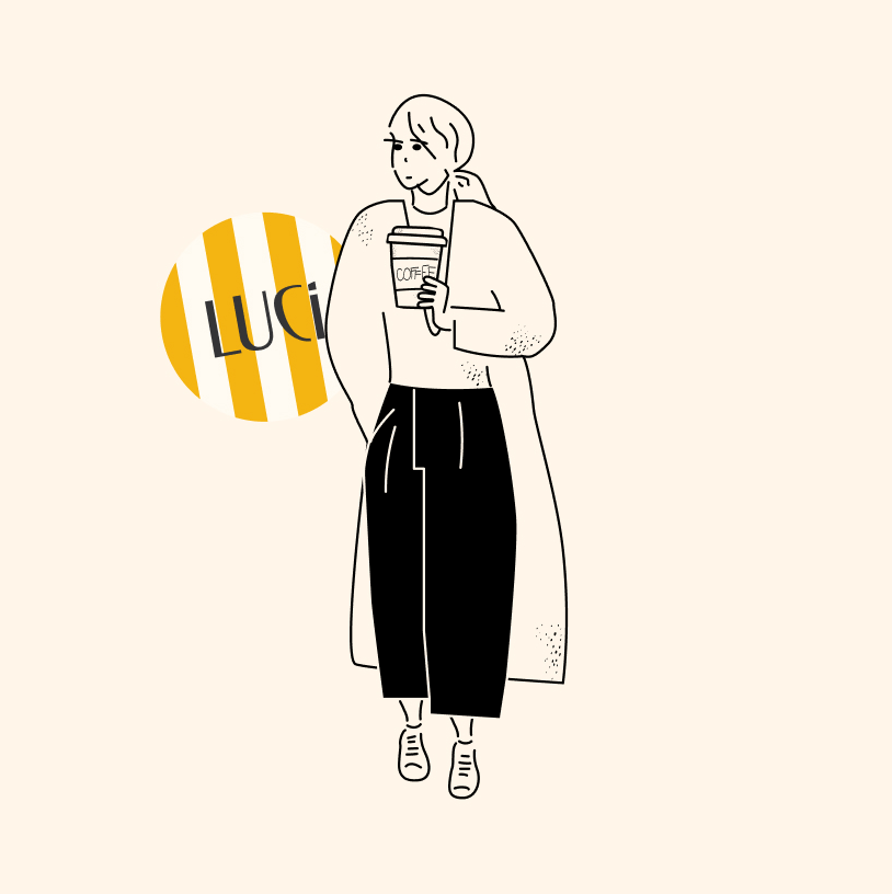
Brand Refresh
The updated identity introduced a lighter palette of yellows, cream tones, and striped graphic elements inspired by the restaurant itself. As part of the redesign, Club Luci was simplified into three clear stages - Earn, Check, and Spend - making the programme easier to understand and communicate.


Outcome
The refreshed identity created a more consistent experience across customer touchpoints and provided a clearer framework for communicating the loyalty programme.
The simplified structure made Club Luci easier to understand while strengthening its connection to the wider brand.