
Spell Magazine
Art Direction · Editorial Design · Information Design
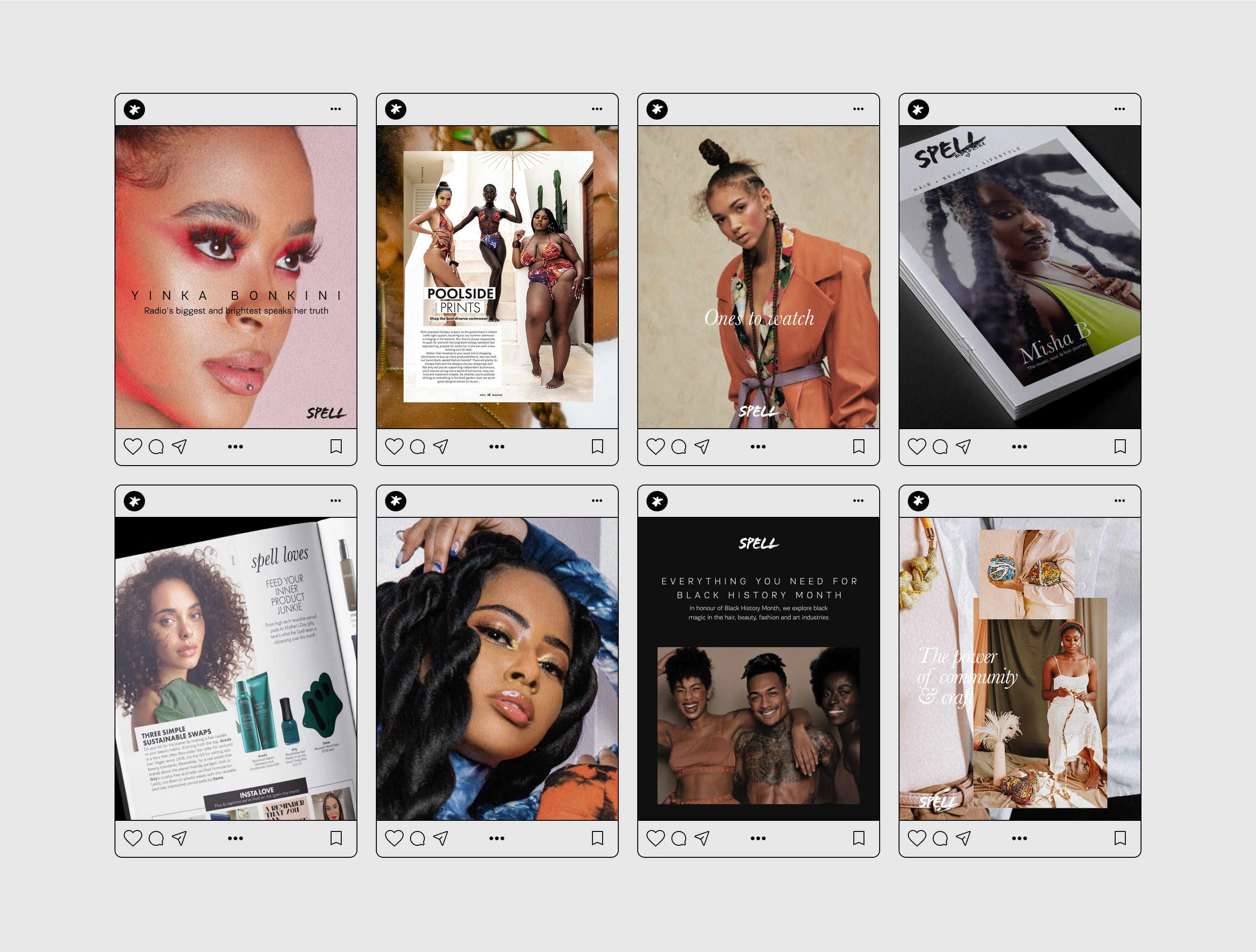
problem
The magazine was struggling to connect with its target audience. Decorative layouts often competed with the content, making the reading experience feel less focused than intended.
Approach
I simplified the visual language and prioritised content over decoration, creating a clearer editorial system that improved readability and consistency across the publication.


Editorial Design System
I removed unnecessary decorative elements and introduced a high-contrast monochrome visual language, allowing the content to take centre stage.
To improve consistency and efficiency, I developed a set of modular templates for recurring story formats. Content hierarchy was simplified, navigation became clearer, and analytics were used throughout the redesign process to inform layout and user experience decisions.
The result was a more confident editorial system that felt aligned with the publication's audience while supporting both print and digital reading behaviours.


Outcome
Digital reading time increased by 40%. The new system improved consistency across issues and helped reposition the publication towards a more editorial-led experience.